Graphs
Oxygen
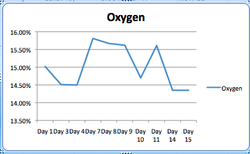
The Blue line represents my Oxygen readings. This is a graph from the first day we began taking readings. This shows the ups and the downs my Oxygen levels experienced over the time the Ecosystem has been sealed.
Carbon Dioxide
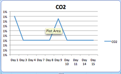
This graph shows my CO2 levels stayed almost the same except there was two stiff peaks, once were it read 1% and once were it read .99%. Other than that the readings were all .9% through out the time we checked them.
Temperature
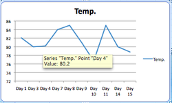
This shows the variation of my temperature readings. Everyday we were getting a different Temp. Reading.
